NewCo
Choosing between trips should feel less like sifting through files, and more like exploring an interactive map full of adventures.
NewCo – Travel App
Product Designer
*this is an NDA protected project. The following designs are abstracted and do not display confidential material.
The Problem
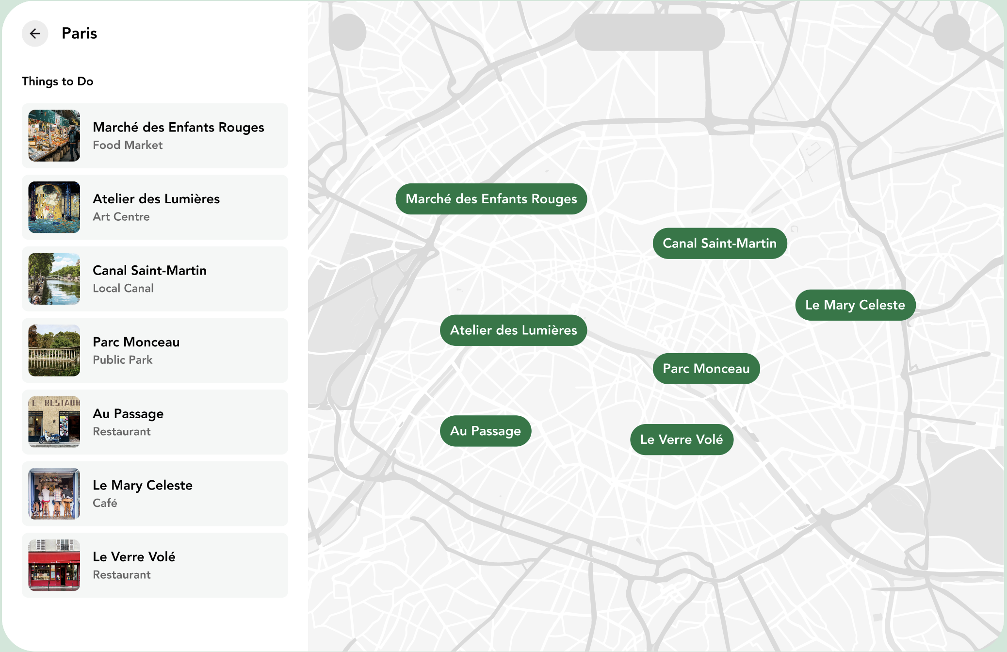
In the original interface, trips were shown in a sidebar as a vertical list of titles with images. Clicking one would update the map. The problem?
The panel took up 40% of the screen, showed the same destinations already represented on the map, and pulled attention away from the main experience.
Users had to process the same info twice, once in text, once in space.
The Approach
We questioned the assumption that a side panel was necessary at all. Why double up information?
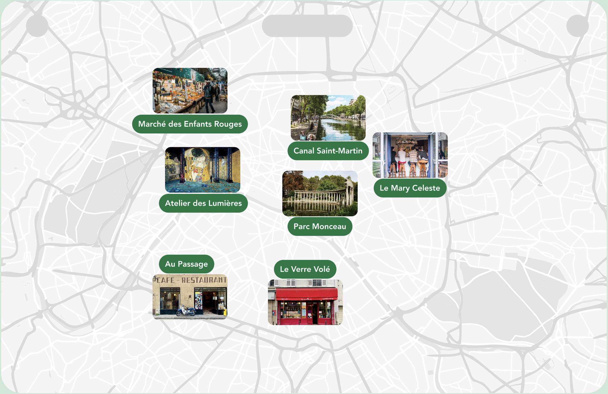
Instead, we reimagined the interaction to make the map itself the selector. Each destination point was turned into a visual card, glimpses of where users would stay, not just a dot and a name.
This way, the map wasn’t just a backdrop. It was the interface.
The Solution
Removed the sidebar entirely, reclaiming 40% of screen real estate.
Transformed map markers into tappable image cards with location previews.
Clicking a card smoothly zoomed into a preview.
Each visual cue gave users a better sense of where they’d stay—creating a bridge between curiosity and commitment.
Reflection
This project taught me that minimal doesn’t mean removing complexity—it means removing friction.
By cutting the redundant UI, we let the core experience breathe. And sometimes the best interface is no interface at all.
NewCo
Choosing between trips should feel less like sifting through files, and more like exploring an interactive map full of adventures.
NewCo – Travel App
Product Designer
*this is an NDA protected project. The following designs are abstracted and do not display confidential material.
The Problem
In the original interface, trips were shown in a sidebar as a vertical list of titles with images. Clicking one would update the map. The problem?
The panel took up 40% of the screen, showed the same destinations already represented on the map, and pulled attention away from the main experience.
Users had to process the same info twice, once in text, once in space.

The Approach
We questioned the assumption that a side panel was necessary at all. Why double up information?
Instead, we reimagined the interaction to make the map itself the selector. Each destination point was turned into a visual card, glimpses of where users would stay, not just a dot and a name.
This way, the map wasn’t just a backdrop. It was the interface.

The Solution
Removed the sidebar entirely, reclaiming 40% of screen real estate.
Transformed map markers into tappable image cards with location previews.
Clicking a card smoothly zoomed into a preview.
Each visual cue gave users a better sense of where they’d stay—creating a bridge between curiosity and commitment.
Reflection
This project taught me that minimal doesn’t mean removing complexity, it means removing friction.
By cutting the redundant UI, we let the core experience breathe. And sometimes the best interface is no interface at all.
NewCo
Choosing between trips should feel less like sifting through files, and more like exploring an interactive map full of adventures.
NewCo – Travel App
Product Designer
*this is an NDA protected project. The following designs are abstracted and do not display confidential material.
The Problem
In the original interface, trips were shown in a sidebar as a vertical list of titles with images. Clicking one would update the map. The problem?
The panel took up 40% of the screen, showed the same destinations already represented on the map, and pulled attention away from the main experience.
Users had to process the same info twice, once in text, once in space.


The Approach
We questioned the assumption that a side panel was necessary at all. Why double up information?
Instead, we reimagined the interaction to make the map itself the selector. Each destination point was turned into a visual card, glimpses of where users would stay, not just a dot and a name.
This way, the map wasn’t just a backdrop. It was the interface.
The Solution
Removed the sidebar entirely, reclaiming 40% of screen real estate.
Transformed map markers into tappable image cards with location previews.
Clicking a card smoothly zoomed into a preview.
Each visual cue gave users a better sense of where they’d stay—creating a bridge between curiosity and commitment.
Reflection