Nomo
What if planning a trip felt more like chatting with someone who just gets you, and instantly builds your dream itinerary?
Nomo – AI-Powered Solo Travel App
Founder & Product Designer
The Goal
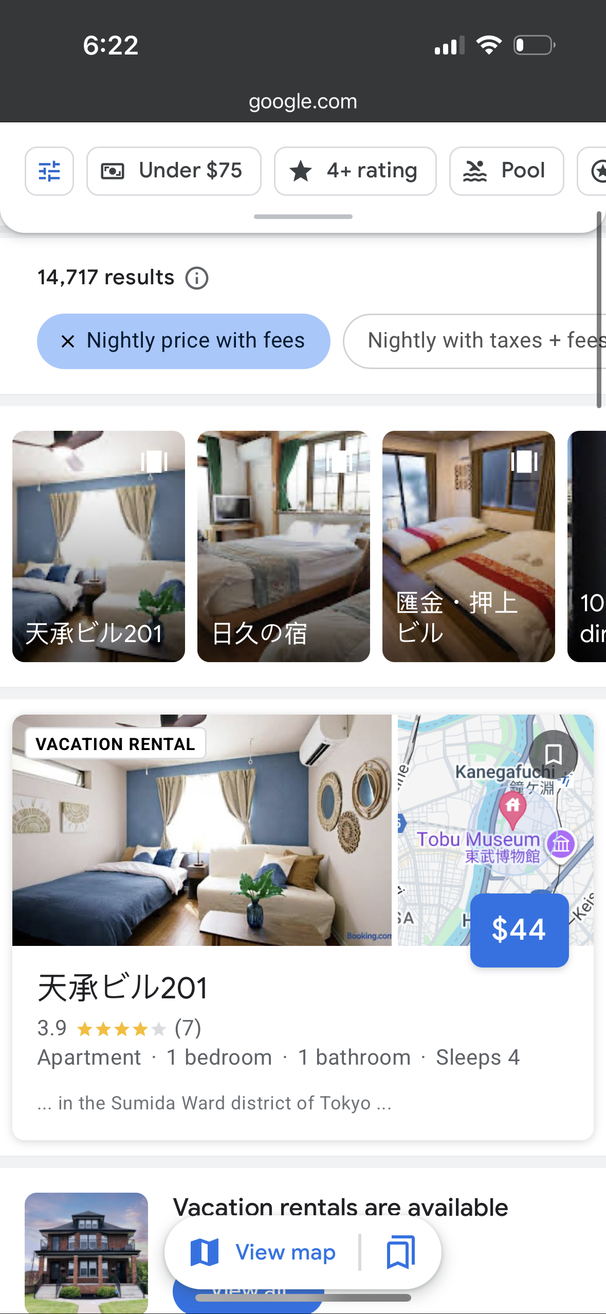
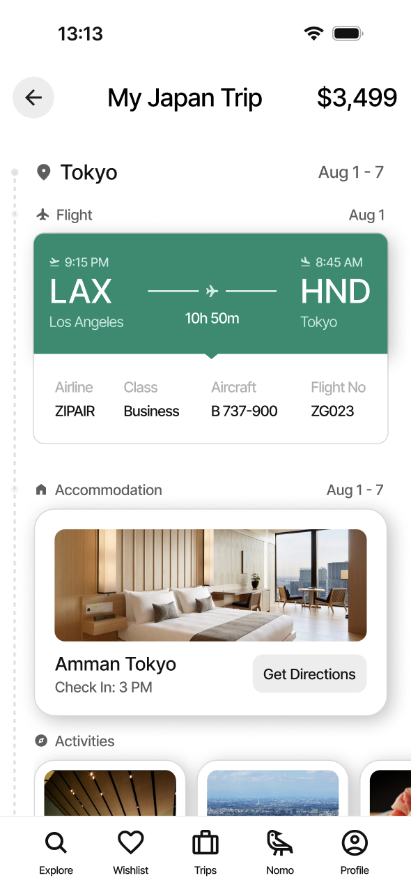
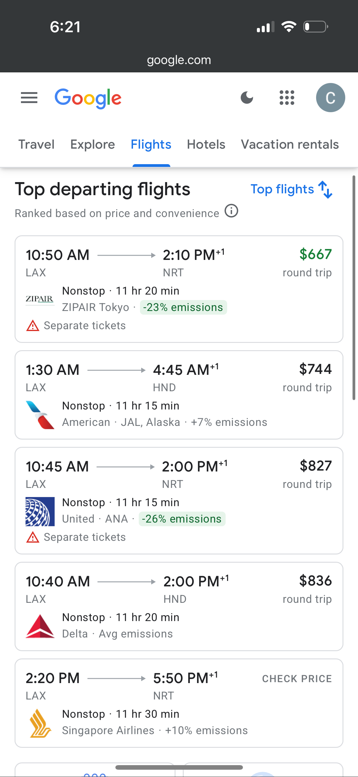
Planning a trip is overwhelming when every small change requires hunting through endless lists of hotels, flights, and activities.
The Problem
But how do you design a conversation where the AI’s response isn’t just text, but a live-updating itinerary?
I couldn’t rely on chat bubbles because users needed to see how their trip was changing in real-time.
The Approach
We explored multiple ways users could interact with AI: chat bubbles? Inline edits? Timeline controls?
None of them clearly showed what the AI actually did.
So we designed something a hybrid system where users give natural prompts, and the AI responds with visual changes + plain language explanations.
The Solution
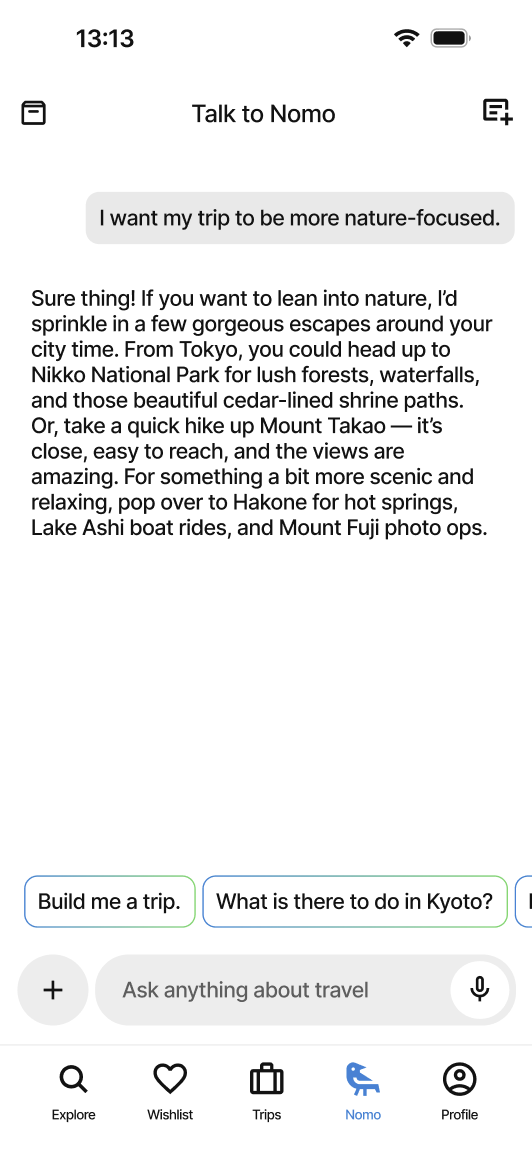
Users enter simple prompts like “I want my trip to be more nature-focused.”
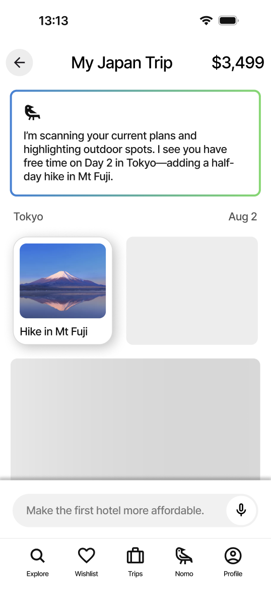
- The AI updates the itinerary and visually highlights what changed
- An explanation appears next to the edit: “Swapped Tokyo day trip for Hakone onsen visit”
Every change feels traceable, editable, and natural.
User Testing & Iteration
Initial testers felt confused when changes happened with no context.
We added subtle highlights and “change cards” that break down what the AI did—step by step.
Suddenly it clicked:
“This feels like having a smart assistant and transparent editor.”
Reflection
Building this reminded me that good AI UX isn’t just about the magic, it’s about the translation.
People don’t trust what they can’t see, so we made every step visible. Not just what changed, but why.
Nomo
What if planning a trip felt more like chatting with someone who just gets you, and instantly builds your dream itinerary?
Nomo – AI-Powered Solo Travel App
Founder & Product Designer
The Goal
Planning a trip is overwhelming when every small change requires hunting through endless lists of hotels, flights, and activities.

The Problem
But how do you design a conversation where the AI’s response isn’t just text, but a live-updating itinerary?
I couldn’t rely on chat bubbles because users needed to see how their trip was changing in real-time.

The Approach
We explored multiple ways users could interact with AI: chat bubbles? Inline edits? Timeline controls?
None of them clearly showed what the AI actually did.
So we designed something a hybrid system where users give natural prompts, and the AI responds with visual changes + plain language explanations.

The Solution
Users enter simple prompts like “I want my trip to be more nature-focused.”
- The AI updates the itinerary and visually highlights what changed
- An explanation appears next to the edit: “Swapped Tokyo day trip for Hakone onsen visit”
Every change feels traceable, editable, and natural.
User Testing & Iteration
Initial testers felt confused when changes happened with no context.
We added subtle highlights and “change cards” that break down what the AI did—step by step.
Suddenly it clicked:
“This feels like having a smart assistant and transparent editor.”


Reflection
Building this reminded me that good AI UX isn’t just about the magic, it’s about the translation.
People don’t trust what they can’t see, so we made every step visible. Not just what changed, but why.
Nomo
What if planning a trip felt more like chatting with someone who just gets you, and instantly builds your dream itinerary?
Nomo – AI-Powered Solo Travel App
Founder & Product Designer

The Goal
Planning a trip is overwhelming when every small change requires hunting through endless lists of hotels, flights, and activities.
The Problem
But how do you design a conversation where the AI’s response isn’t just text, but a live-updating itinerary?
I couldn’t rely on chat bubbles because users needed to see how their trip was changing in real-time.


The Approach
We explored multiple ways users could interact with AI: chat bubbles? Inline edits? Timeline controls?
None of them clearly showed what the AI actually did.
So we designed something a hybrid system where users give natural prompts, and the AI responds with visual changes + plain language explanations.
The Solution
Users enter simple prompts like “I want my trip to be more nature-focused.”
- The AI updates the itinerary and visually highlights what changed
- An explanation appears next to the edit: “Swapped Tokyo day trip for Hakone onsen visit”
Every change feels traceable, editable, and natural.


User Testing & Iteration
Initial testers felt confused when changes happened with no context.
We added subtle highlights and “change cards” that break down what the AI did, step by step.
Suddenly it clicked:
“This feels like having a smart and transparent assistant.”
Reflection