Cameron کامران
F33
How do you bring AWS, Azure, and Google Cloud into one platform, and actually make it usable?
F33 – Cloud Manager
Product Designer
The Problem
Sometimes users loved a trip… except for one city. Maybe they’d already been. Maybe it didn’t interest them. Maybe it just wasn’t the vibe.
We had curated routes like “London, Paris, Madrid”—but what if someone wanted “London, Amsterdam, Copenhagen” instead?The challenge was to offer smart, pre-built variants of each trip without crowding the UI or making users start over.
The Challenge
I started with customer interviews and internal QA feedback. Themes quickly emerged:
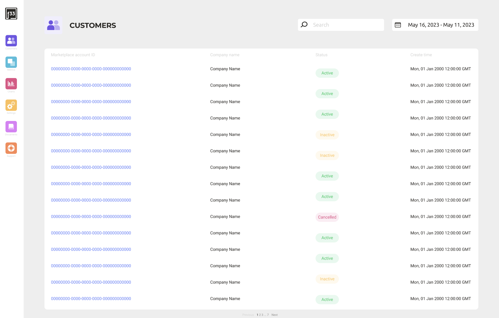
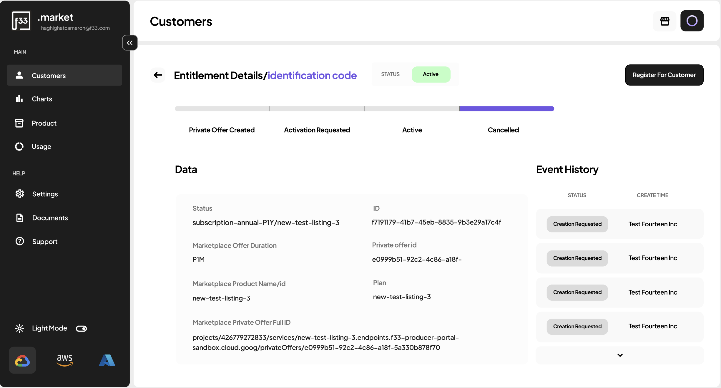
- Users struggled to find specific data like entitlement info or Private Offer IDs
- Navigation lacked structure, people got lost moving between sections
- It wasn’t obvious that all three cloud services were actually available in one place
From there, I reworked the architecture to make discovery intuitive.

The Solution
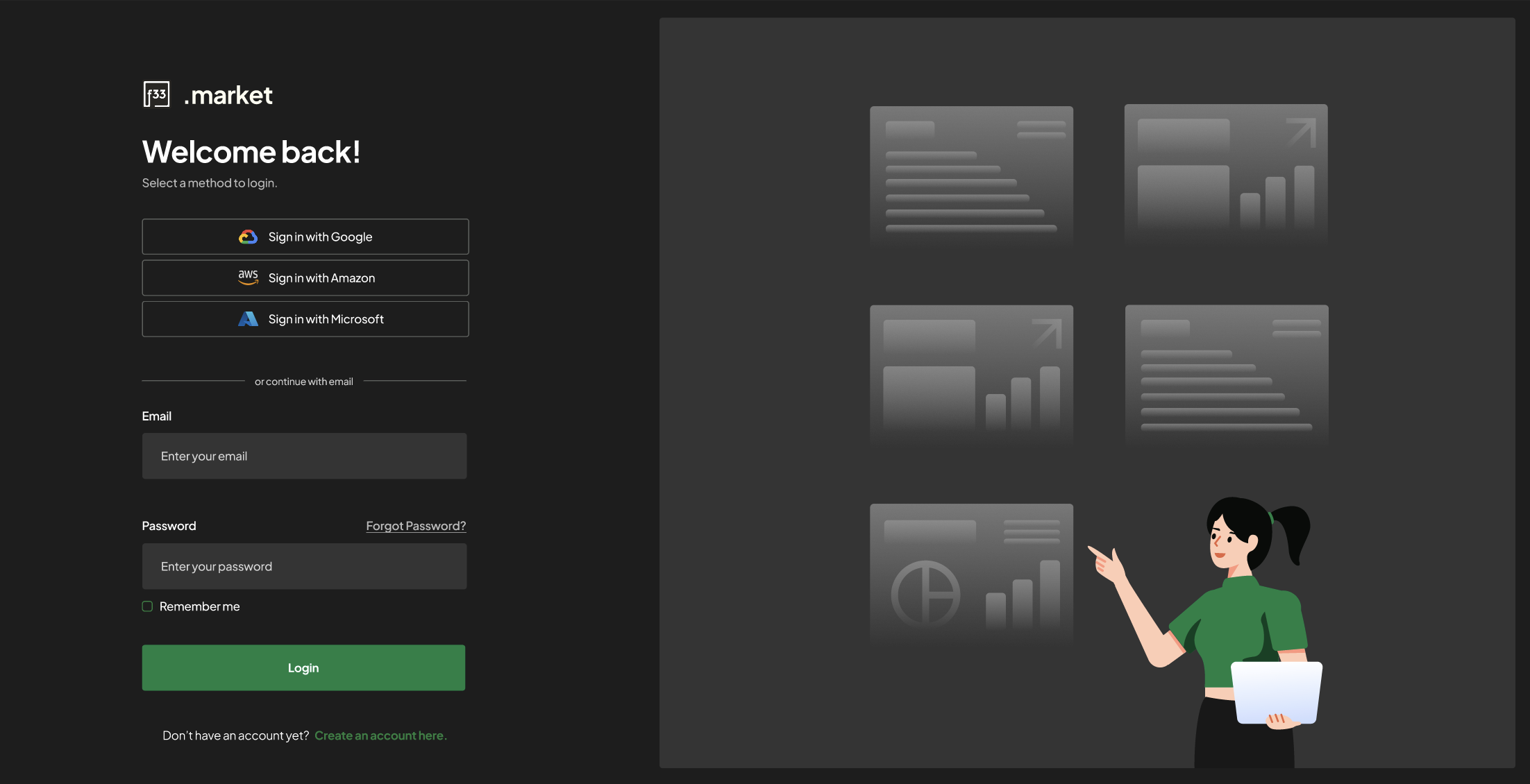
- Clear cloud branding to show AWS, Azure, and Google Cloud are all supported
- Smart filters to help users locate entitlements and contract data instantly
- Breadcrumbs + back arrows for easy navigation between related pages
- New hover and cursor states to clarify interactive elements
Impact
- Users could now find key identifiers in seconds, not minutes
- Dev team reported fewer support tickets related to navigation confusion
- Customers began adopting the unified cloud model instead of defaulting to separate platforms
Reflection
This project taught me that complexity isn’t the enemy, ambiguity is. By clarifying navigation and surfacing the right details, we gave power users the control they needed without making them dig for it.
Cameron کامران
F33
How do you bring AWS, Azure, and Google Cloud into one platform, and actually make it usable?
F33 – Cloud Manager
Product Designer
The Problem
Sometimes users loved a trip… except for one city. Maybe they’d already been. Maybe it didn’t interest them. Maybe it just wasn’t the vibe.
We had curated routes like “London, Paris, Madrid”—but what if someone wanted “London, Amsterdam, Copenhagen” instead?The challenge was to offer smart, pre-built variants of each trip without crowding the UI or making users start over.
The Challenge
I started with customer interviews and internal QA feedback. Themes quickly emerged:
- Users struggled to find specific data like entitlement info or Private Offer IDs
- Navigation lacked structure, people got lost moving between sections
- It wasn’t obvious that all three cloud services were actually available in one place
From there, I reworked the architecture to make discovery intuitive.
The Solution
- Clear cloud branding to show AWS, Azure, and Google Cloud are all supported
- Smart filters to help users locate entitlements and contract data instantly
- Breadcrumbs + back arrows for easy navigation between related pages
- New hover and cursor states to clarify interactive elements
Impact
- Users could now find key identifiers in seconds, not minutes
- Dev team reported fewer support tickets related to navigation confusion
- Customers began adopting the unified cloud model instead of defaulting to separate platforms
Reflection
This project taught me that complexity isn’t the enemy, ambiguity is. By clarifying navigation and surfacing the right details, we gave power users the control they needed without making them dig for it.
Cameron کامران
F33
How do you bring AWS, Azure, and Google Cloud into one platform, and actually make it usable?
F33 – Cloud Manager
Product Designer
The Problem
The original platform technically unified AWS, Azure, and Google Cloud, but users didn’t feel it.
Navigation was clunky, and key details like Private Offer IDs were buried.
It wasn’t clear what clouds were supported, or how to jump between providers and even basic tasks like finding contract info took too many clicks.
The Challenge
I started with customer interviews and internal QA feedback. Themes quickly emerged:
- Users struggled to find specific data like entitlement info or Private Offer IDs
- Navigation lacked structure, people got lost moving between sections
- It wasn’t obvious that all three cloud services were actually available in one place
From there, I reworked the architecture to make discovery intuitive.
The Solution
- Clear cloud branding to show AWS, Azure, and Google Cloud are all supported
- Smart filters to help users locate entitlements and contract data instantly
- Breadcrumbs + back arrows for easy navigation between related pages
- New hover and cursor states to clarify interactive elements
Impact
- Users could now find key identifiers in seconds, not minutes
- Dev team reported fewer support tickets related to navigation confusion
- Customers began adopting the unified cloud model instead of defaulting to separate platforms
Reflection