NewCo
We wanted users to feel like they had a local expert walking them through every museum, gallery, and landmark, without breaking their flow.
NewCo – Travel App
Product Designer
*this is an NDA protected project. The following designs are abstracted and do not display confidential material.
The Problem
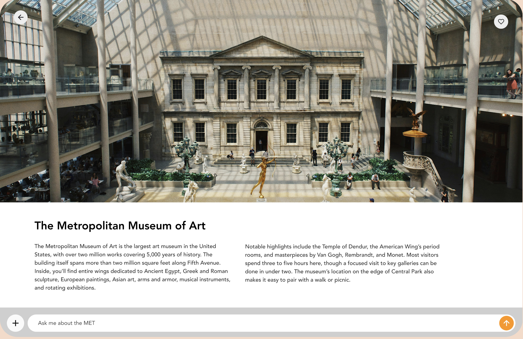
As part of a larger immersive travel experience, we wanted users to explore annotated galleries of cultural landmarks and ask questions like “Why is the MET so famous?” without needing to leave the screen or feel interrupted.
The Challenge
How can we fit a conversational AI interface into a visually rich page without distracting from the primary content? We needed something that was always accessible, but never in the way.
The Approach & Solution
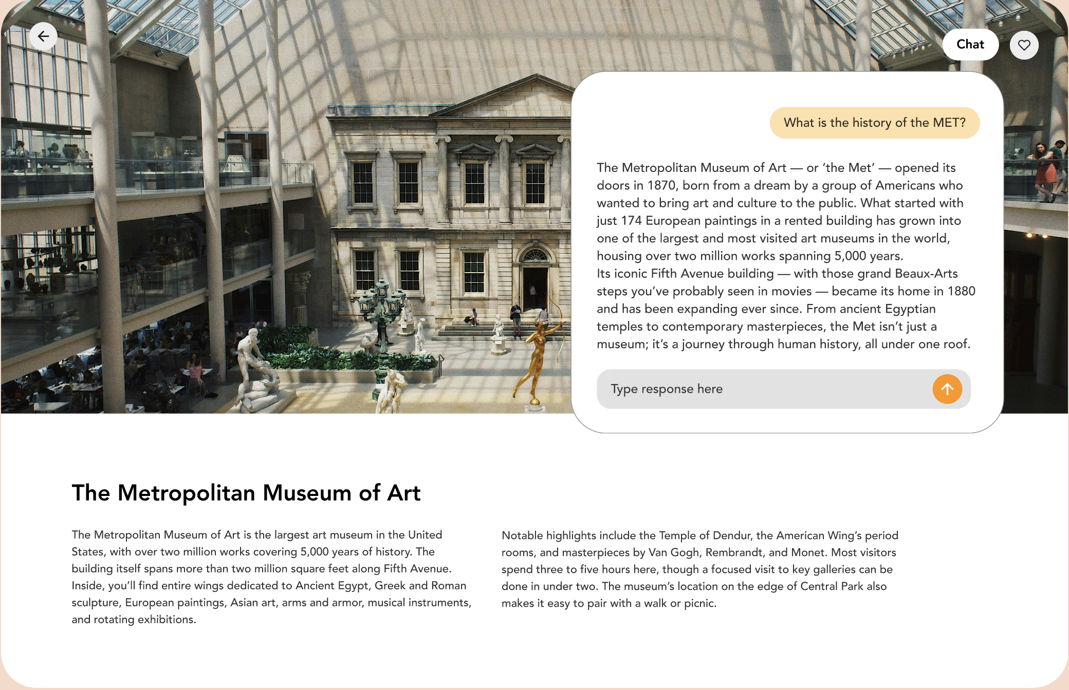
We explored floating chat icons, overlays, and split screens, but all of them disrupted the gallery experience. Instead, I proposed a seamless scroll-based solution:
When the user engages with the AI, the screen scrolls down into a conversation view. It feels like turning a page, not opening a new window.
The top still anchors the gallery context, while the bottom becomes a space to dive deeper, naturally.
Reflection
This project taught me the importance of designing for mental flow. Even when adding advanced features like AI, the experience should feel like a natural extension of the page, not a detour.
NewCo
We wanted users to feel like they had a local expert walking them through every museum, gallery, and landmark, without breaking their flow.
NewCo – Travel App
Product Designer
*this is an NDA protected project. The following designs are abstracted and do not display confidential material.
The Problem
As part of a larger immersive travel experience, we wanted users to explore annotated galleries of cultural landmarks and ask questions like “Why is the MET so famous?” without needing to leave the screen or feel interrupted.

The Challenge
How can we fit a conversational AI interface into a visually rich page without distracting from the primary content? We needed something that was always accessible, but never in the way.

The Approach & Solution
We explored floating chat icons, overlays, and split screens, but all of them disrupted the gallery experience. Instead, I proposed a seamless scroll-based solution:
When the user engages with the AI, the screen scrolls down into a conversation view. It feels like turning a page, not opening a new window.
The top still anchors the gallery context, while the bottom becomes a space to dive deeper, naturally.
Reflection
This project taught me the importance of designing for mental flow. Even when adding advanced features like AI, the experience should feel like a natural extension of the page, not a detour.
NewCo
We wanted users to feel like they had a local expert walking them through every museum, gallery, and landmark, without breaking their flow.
NewCo – Travel App
Product Designer
*this is an NDA protected project. The following designs are abstracted and do not display confidential material.

The Problem
As part of a larger immersive travel experience, we wanted users to explore annotated galleries of cultural landmarks and ask questions like “Why is the MET so famous?” without needing to leave the screen or feel interrupted.
The Challenge
How can we fit a conversational AI interface into a visually rich page without distracting from the primary content? We needed something that was always accessible, but never in the way.

The Approach & Solution
We explored floating chat icons, overlays, and split screens, but all of them disrupted the gallery experience. Instead, I proposed a seamless scroll-based solution:
When the user engages with the AI, the screen scrolls down into a conversation view. It feels like turning a page, not opening a new window.
The top still anchors the gallery context, while the bottom becomes a space to dive deeper, naturally.
Reflection